Opera Idaho
Brand Renewal: Opera Idaho
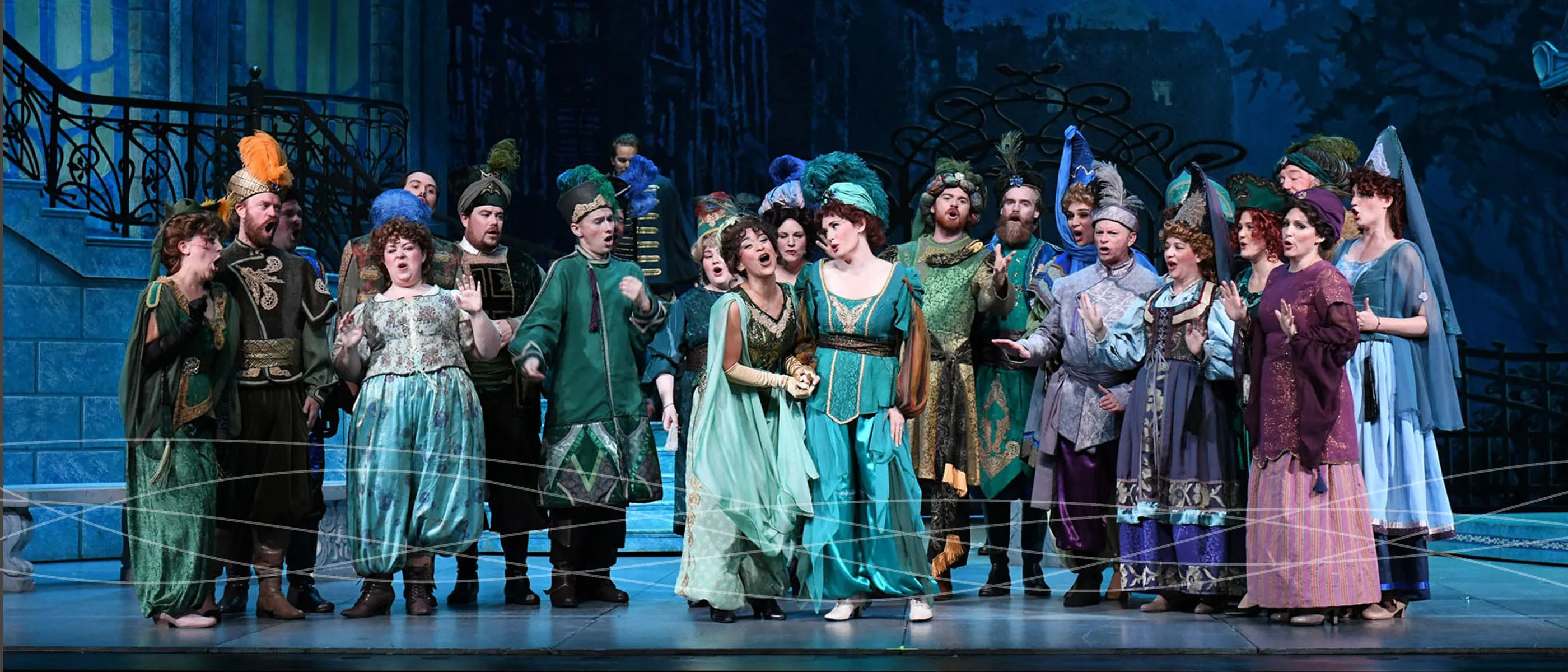
It's the voices!
The primary mission of Opera Idaho is to fund and produce grand opera of the highest possible professional standard, in Boise and throughout the State of Idaho, and to foster wider acceptance, appreciation and enjoyment of opera and related art forms in young people and adults of all social and economic backgrounds, through diverse educational and outreach programs.
The affiliation of Opera Idaho with Creative Soapbox began late in the 2006-2007 opera season when we donated some time for a program layout. This soon blossomed into a working relationship that over the next few years resulted in a complete rebrand and powerful brand position.
Challenge
Reposition the Opera Idaho without jeopardizing or alienating the community.
Outcome
An identity and brand that is progressive, historic, and unified. The strength and simplicity combines feminine and masculine characteristics to yield a brand that conveys both integrity and emotion.
Industry
Date Completed
June 2014
A brand starts with its values
Since the 1960's, Opera Idaho has been entertaining audiences in Boise and beyond. The primary mission of Opera Idaho is to fund and produce grand opera of the highest possible professional standard, in Boise and throughout the State of Idaho, and to foster wider acceptance, appreciation and enjoyment of opera and related art forms in young people and adults of all social and economic backgrounds, through diverse educational and outreach programs. Creative Soapbox utilized this positioning as a launching pad for identity exploration.
A new brand is born
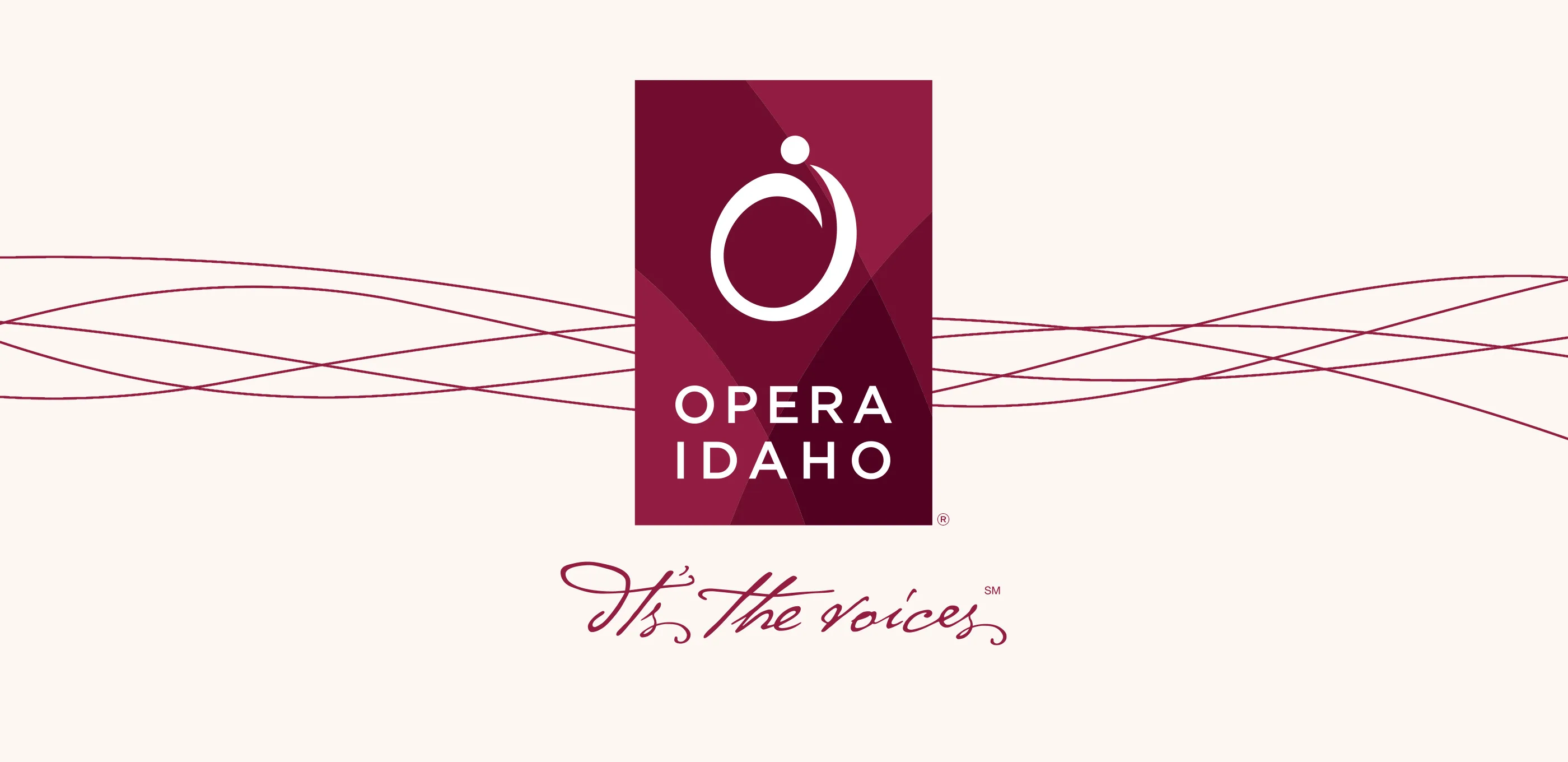
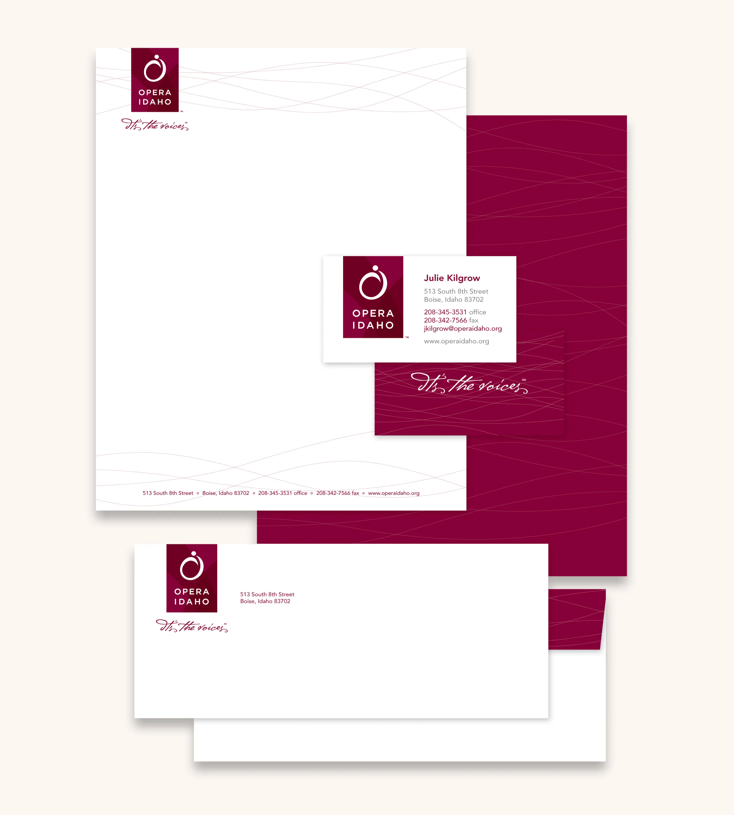
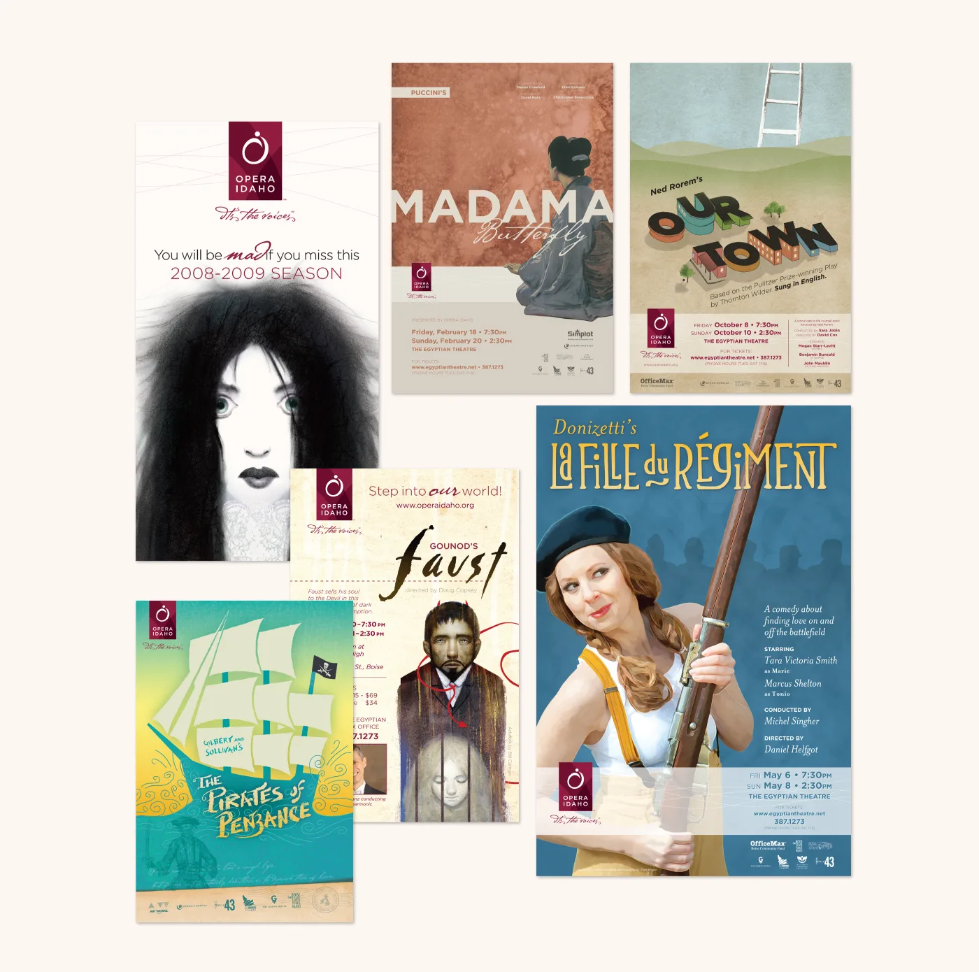
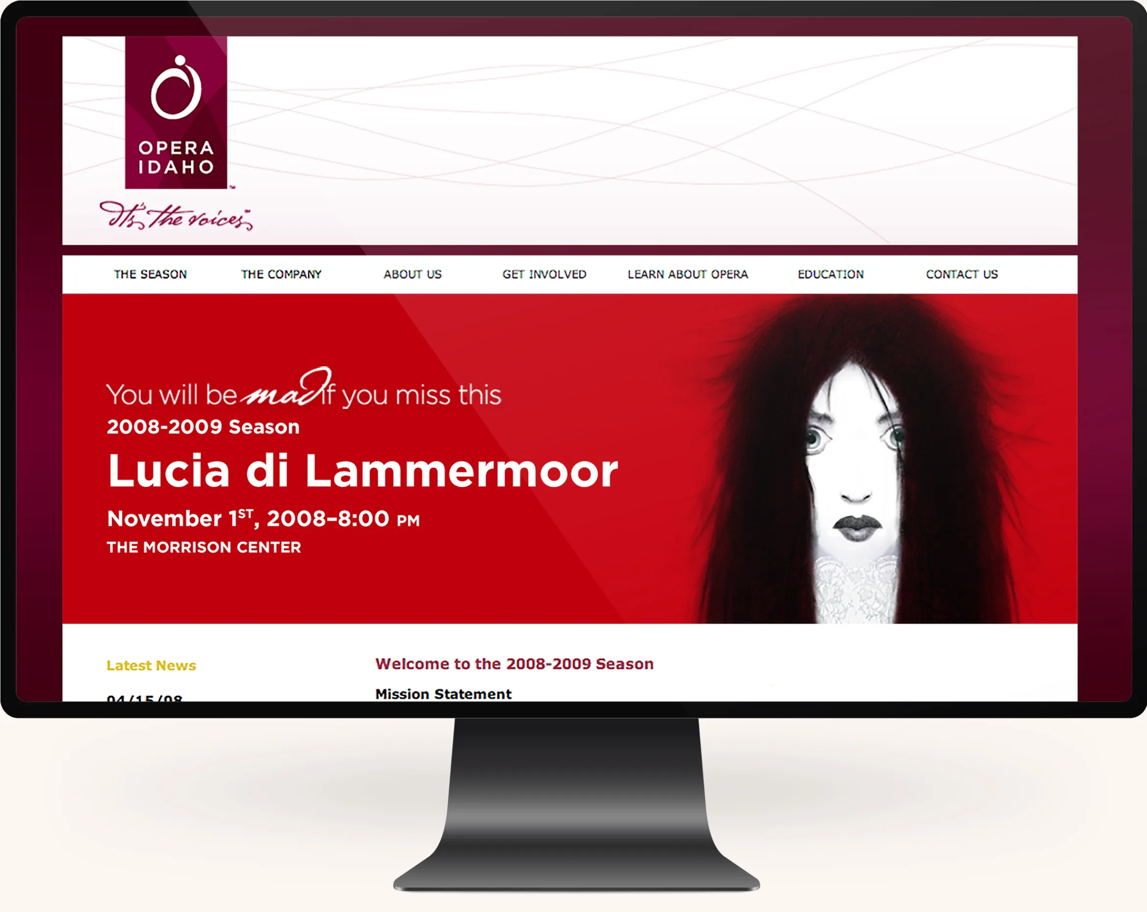
The new identity is progressive, historic, and unified. The strength and simplicity combines feminine and masculine characteristics to yield a brand that conveys both integrity and emotion. It has been derived from several different elements including the letter forms “O” and “I” and influenced by several musical symbols and notes such as the fermata. The variation of a single color represents the complexity and range of the voices. It is a convergence of royalty (purple) and passion (red). The typeface is strictly representative of strength and stability of Opera Idaho and has a long history of use in sign design in New York City and the arts. The tagline compliments the mark with a sense of artistic flair.
Let's build your soapbox.
We can work with your existing team or scale to become your team.


